TRAVEL SPHERE
T-BANK
SENIOR DESIGHER
2024 — 2025
Summary
Problem
Low user retention and poor cross-selling performance — most users purchased only one travel product and didn’t return to the service
Goal
Create a unified, user-friendly travel experience that supports users through all stages of their journey — before, during, and after a trip, while increasing retention, conversions, and service usage
What was done
Redesigned the travel section as part of a new ecosystem approach, focusing on inspiration, seamless planning, and in-trip support. Defined hypotheses, prioritized key JTBD, launched an MLP

Result
Increased average conversion to core travel services, improved retention and order volume. The new experience successfully encouraged repeat use and multi-service adoption.
What are Spheres?
In November 2024, a major update to the T-Bank app took place. The idea was to rebuild the product ecosystem from a business logic perspective (financial products) to a user-centric one, based on the user's areas of interest: home, car, travel, shopping. The mobile app became more aligned with the aspects of customers' lives and began to work more precisely with different user segments.
What is the Travel sphere?
The travel sphere is a travel ecosystem where a person can plan their trip from scratch, organize their leisure activities, and receive support throughout their journey.
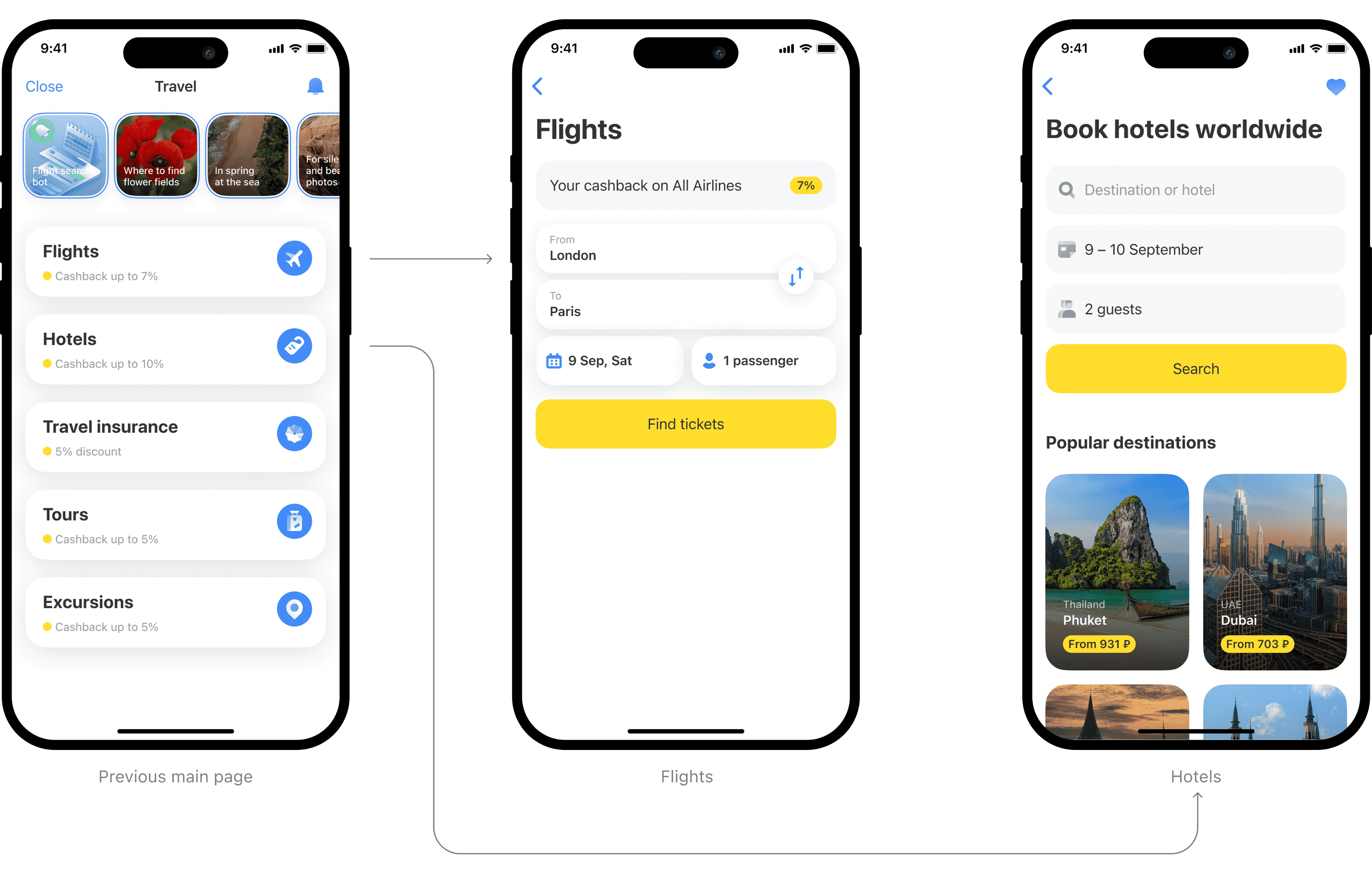
The travel section at that time looked like this: stories and cards directing to specific services.
Business goals
✦ positioning the product as an ecosystem for travel
✦ increasing penetration in travel services
✦ raising the average transaction value
✦ further scaling the service
✦ building a habit of more frequent product usage
✦ increasing the number of orders
User goals
To create a unified travel service that helps users plan their trip from scratch, track order statuses, organize leisure activities during the trip, and receive support throughout the journey.
Success criteria
✦ increasing conversion into meaningful actions (purchases of travel products)
✦ reducing the number of customer support inquiries about orders
✦ reducing churn on the main screen
✦ increasing revenue
✦ increasing retention
Discovery
At the start, we conducted a competitor benchmark, described customer jobs, and formulated hypotheses. Our MLP version was designed to cover 3 main jobs:
✦ inspire the user to travel
✦ help plan the trip
✦ address needs during the trip
Hypothesis 1
If we offer inspiring content to users who haven't purchased products, we will increase the retention rate.
Hypothesis 2
If, after the order, we show the user a section with all the trip details, we will increase the retention rate and user loyalty.

Hypothesis 3
If we eliminate the main pages of each service in favor of a unified search, it will increase the speed of trip planning and reduce the support costs for individual main pages.
After the discovery phase, we, along with the product team, compiled a large list of ideas on how to develop the travel sphere. I transformed these ideas into concepts to facilitate prioritization and evaluation. Additionally, we had the opportunity to place our widget on the bank's homepage to increase brand recognition and service penetration.
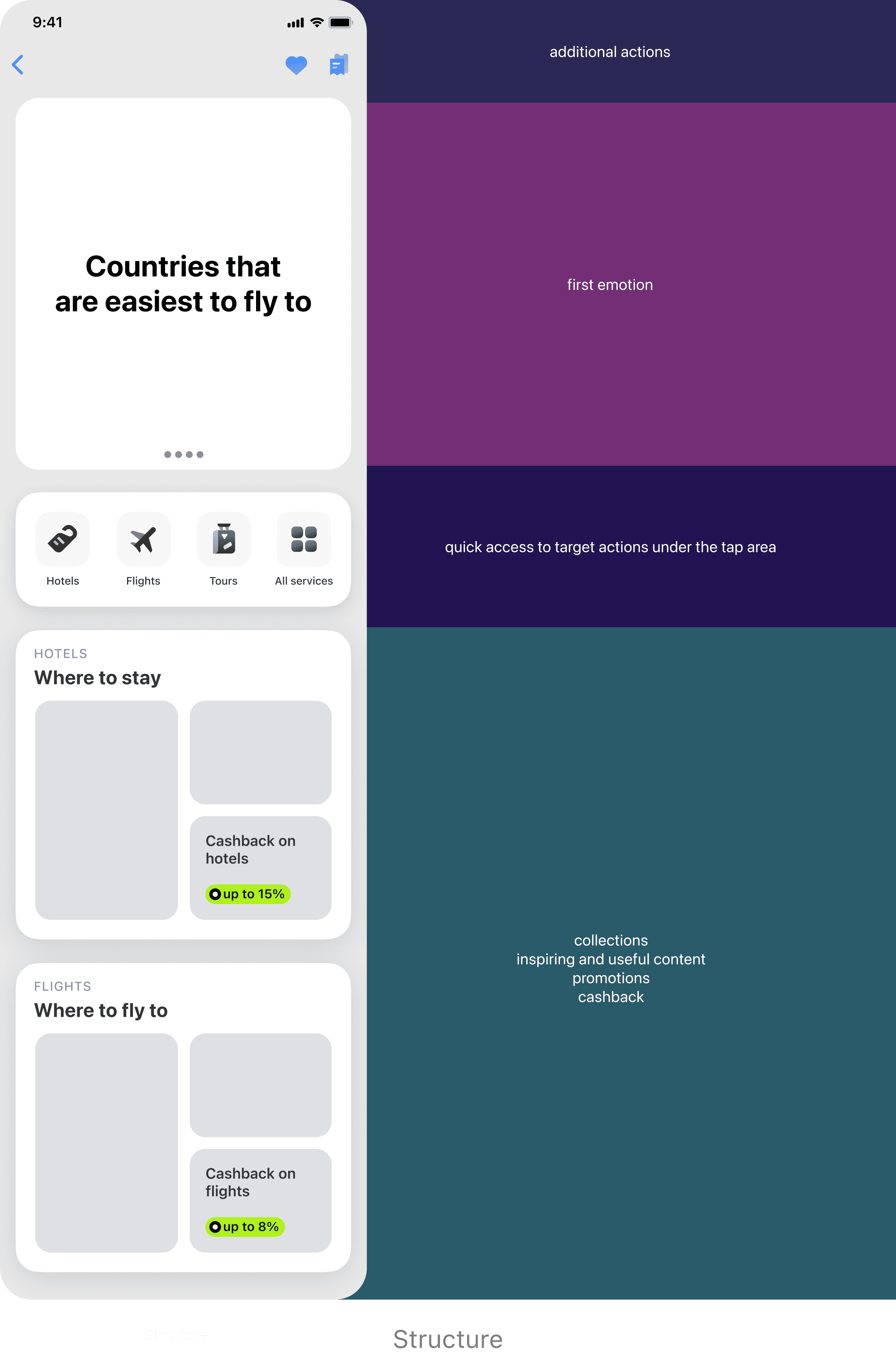
MLP version design
The first step to achieve our goals was deciding to use most of the first viewport for a dynamic block, where we would showcase previews of inspiring travel stories, as well as our promotional offers, such as travel payment in installments, which we strongly believe in.
We also show the customer's personalized cashback on the first screen, calculated based on their accounts, subscriptions, and promotions. Here, users can see their personal cashback for each of their accounts, depending on the service.

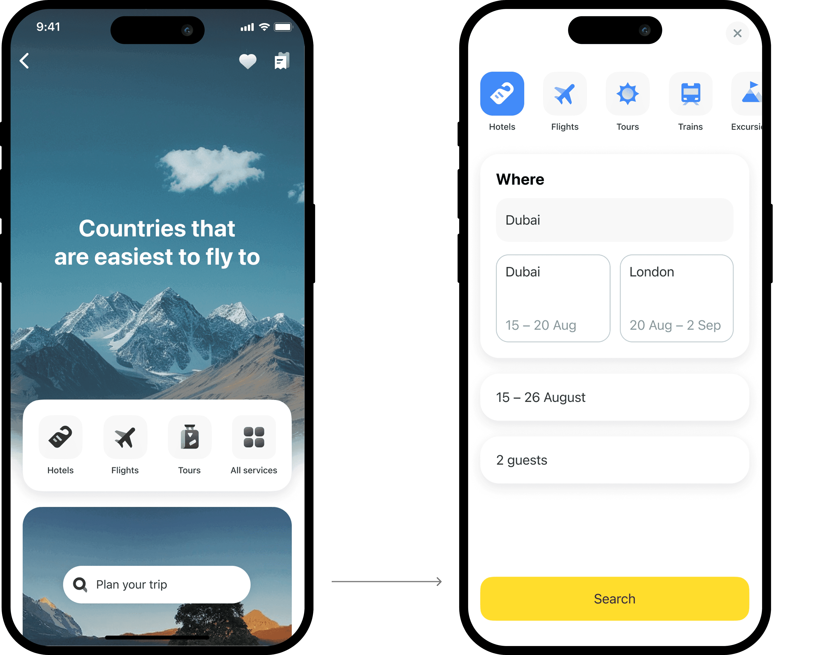
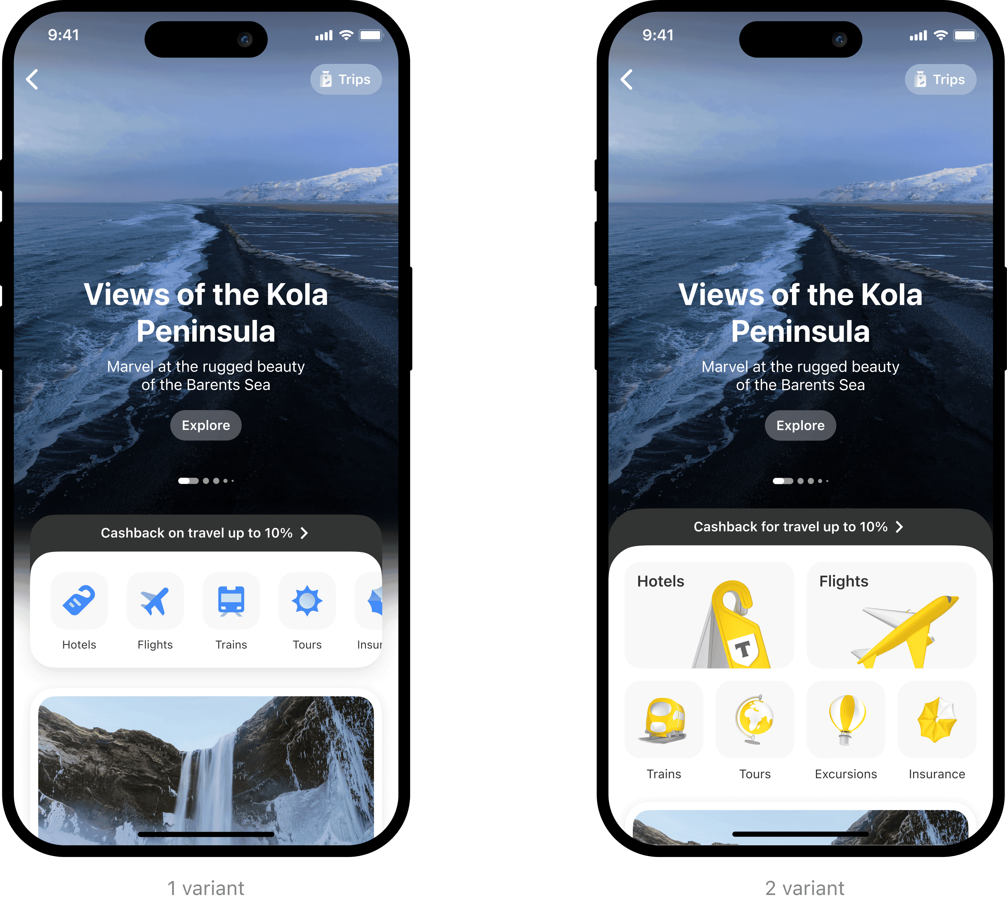
Navigation
In the first iteration, we decided to keep the links to the main pages of the services. We consolidated entry points to travel services into a single block. We conducted an A/B test with two variants, and the navigation with horizontal scrolling statistically performed significantly better.
Travel Assistant
Questions like «How to get there?», «Where to stay?», and «What to do?» are answered by the travel assistant, which helps not only to pick tickets but also to plan, for instance, a walking route during the trip.

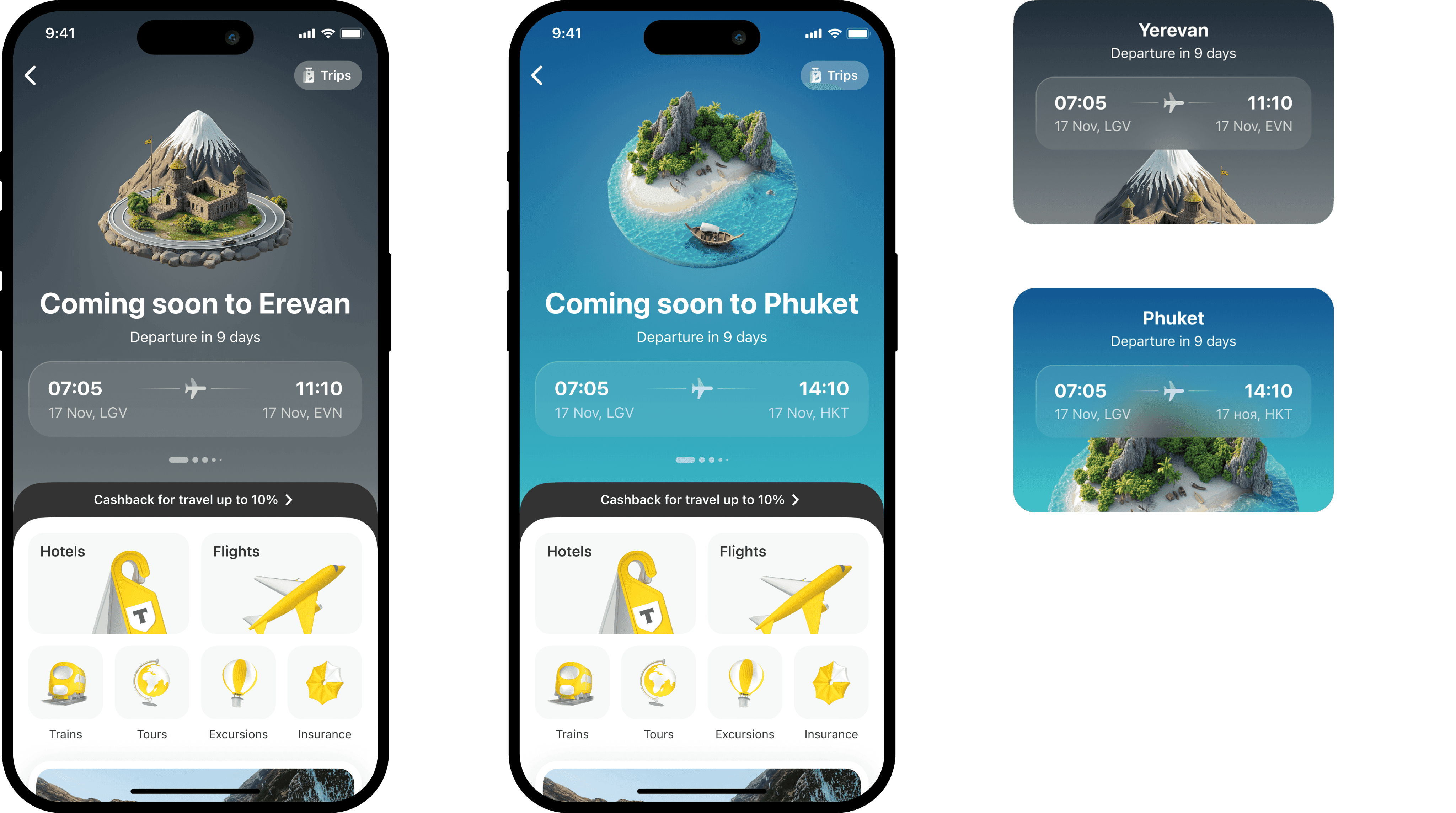
Trip
In the MLP version, the user's active orders transform into a new entity called Trip. Once a user makes their first purchase, they will have a Trips section. Here, they can see a timeline of their active orders. With this section, we aim to increase cross-service penetration and, of course, positively influence retention and loyalty.

I note that we always show the nearest activity first, with archived orders hidden in a stack. Users can view past orders by expanding or collapsing the stack.

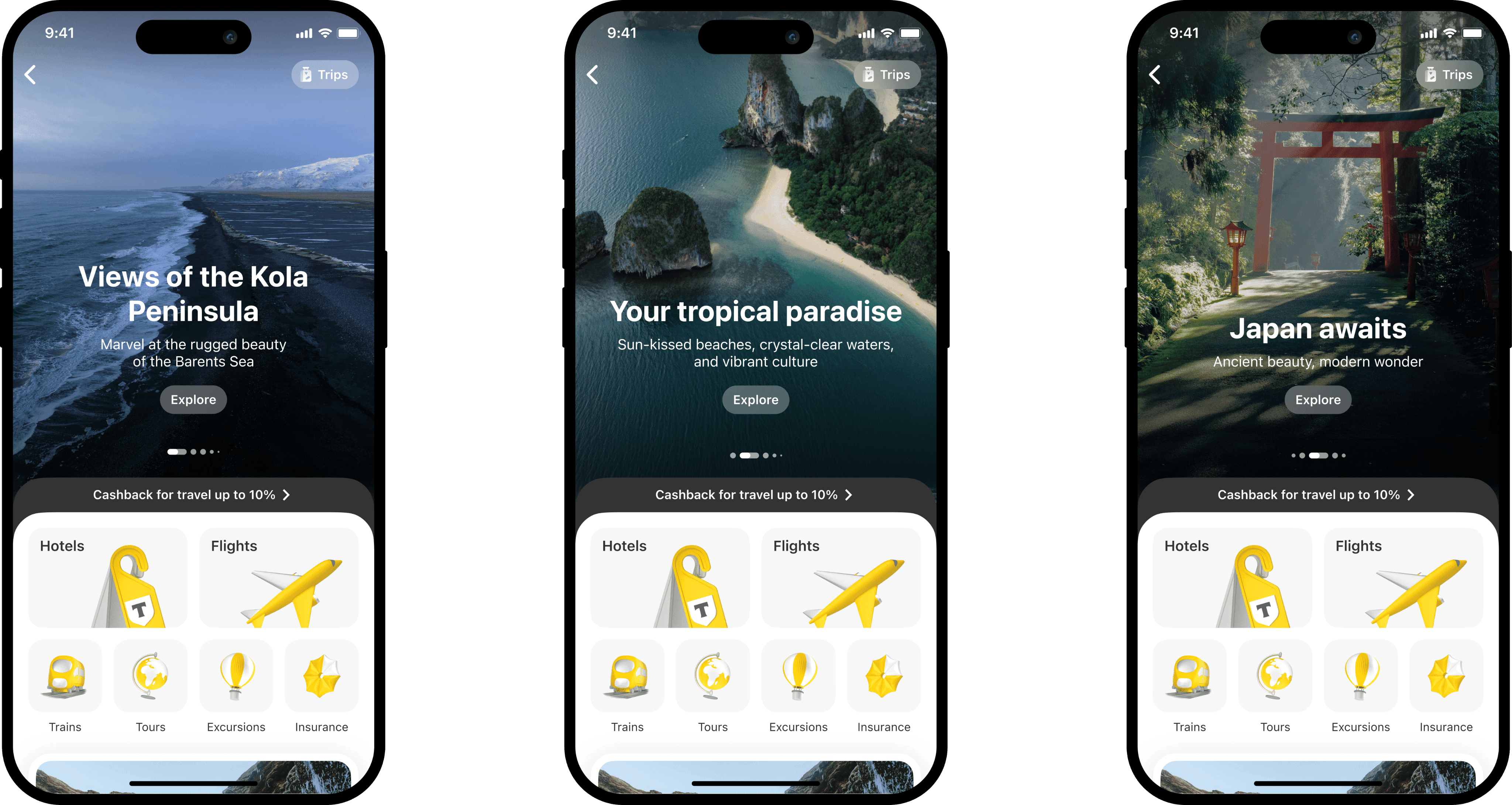
3-D illustrations for trips
Usually, 3-D illustrations are created by the graphic design team. However, the team estimated it would take a year to create illustrations for the 100 most popular destinations. So, our amazing team created the illustrations for cities on their own, utilizing AI tools. The result was fantastic and was completed several times faster than the estimated year.
Usually, 3-D illustrations are created by the graphic design team. However, the team estimated it would take a year to create illustrations for the 100 most popular destinations. So, our amazing team created the illustrations for cities on their own, utilizing AI tools. The result was fantastic and was completed several times faster than the estimated year.
Results and next steps
We saw a statistically significant increase in service entries via the personalized feed and new navigation menu. The hotel product saw the biggest boost, with conversion rates through the funnel and payment conversion increasing. Improved retention and order volume (nda). The new experience successfully encouraged repeat use and multi-service adoption.
My role
✦ understanding the task
✦ discovery phase
✦ lo-fi design and hypothesis creation
✦ prioritizing hypotheses and evaluating them
✦ hi-fi design, prototyping, and animations
✦ collaborative work with the business and development teams
✦ design review
✦ handoff of the project to other designers for further development
TRAVEL SPHERE
T-BANK
SENIOR DESIGHER
2024 — 2025
Summary
Problem
Low user retention and poor cross-selling performance — most users purchased only one travel product and didn’t return to the service
Goal
Create a unified, user-friendly travel experience that supports users through all stages of their journey — before, during, and after a trip, while increasing retention, conversions, and service usage
What was done
Redesigned the travel section as part of a new ecosystem approach, focusing on inspiration, seamless planning, and in-trip support. Defined hypotheses, prioritized key JTBD, launched an MLP
Result
Increased average conversion to core travel services, improved retention and order volume. The new experience successfully encouraged repeat use and multi-service adoption.
What are Spheres?
In November 2024, a major update to the T-Bank app took place. The idea was to rebuild the product ecosystem from a business logic perspective (financial products) to a user-centric one, based on the user's areas of interest: home, car, travel, shopping. The mobile app became more aligned with the aspects of customers' lives and began to work more precisely with different user segments.
What is the Travel sphere?
The travel sphere is a travel ecosystem where a person can plan their trip from scratch, organize their leisure activities, and receive support throughout their journey.
The travel section at that time looked like this: stories and cards directing to specific services.
Business goals
✦ positioning the product as an ecosystem for travel
✦ increasing penetration in travel services
✦ raising the average transaction value
✦ further scaling the service
✦ building a habit of more frequent product usage
✦ increasing the number of orders
User goals
To create a unified travel service that helps users plan their trip from scratch, track order statuses, organize leisure activities during the trip, and receive support throughout the journey.
Success criteria
✦ increasing conversion into meaningful actions (purchases of travel products)
✦ reducing the number of customer support inquiries about orders
✦ reducing churn on the main screen
✦ increasing revenue
✦ increasing retention
Discovery
At the start, we conducted a competitor benchmark, described customer jobs, and formulated hypotheses. Our MLP version was designed to cover 3 main jobs:
✦ inspire the user to travel
✦ help plan the trip
✦ address needs during the trip
Hypothesis 1
If we offer inspiring content to users who haven't purchased products, we will increase the retention rate.
Hypothesis 2
If, after the order, we show the user a section with all the trip details, we will increase the retention rate and user loyalty.
Hypothesis 3
If we eliminate the main pages of each service in favor of a unified search, it will increase the speed of trip planning and reduce the support costs for individual main pages.
After the discovery phase, we, along with the product team, compiled a large list of ideas on how to develop the travel sphere. I transformed these ideas into concepts to facilitate prioritization and evaluation. Additionally, we had the opportunity to place our widget on the bank's homepage to increase brand recognition and service penetration.
MLP version design
The first step to achieve our goals was deciding to use most of the first viewport for a dynamic block, where we would showcase previews of inspiring travel stories, as well as our promotional offers, such as travel payment in installments, which we strongly believe in.
We also show the customer's personalized cashback on the first screen, calculated based on their accounts, subscriptions, and promotions. Here, users can see their personal cashback for each of their accounts, depending on the service.
Navigation
In the first iteration, we decided to keep the links to the main pages of the services. We consolidated entry points to travel services into a single block. We conducted an A/B test with two variants, and the navigation with horizontal scrolling statistically performed significantly better.
Travel Assistant
Questions like «How to get there?», «Where to stay?», and «What to do?» are answered by the travel assistant, which helps not only to pick tickets but also to plan, for instance, a walking route during the trip.
Trip
In the MLP version, the user's active orders transform into a new entity called Trip. Once a user makes their first purchase, they will have a Trips section. Here, they can see a timeline of their active orders. With this section, we aim to increase cross-service penetration and, of course, positively influence retention and loyalty.
I note that we always show the nearest activity first, with archived orders hidden in a stack. Users can view past orders by expanding or collapsing the stack.
3-D illustrations for trips
Usually, 3-D illustrations are created by the graphic design team. However, the team estimated it would take a year to create illustrations for the 100 most popular destinations. So, our amazing team created the illustrations for cities on their own, utilizing AI tools. The result was fantastic and was completed several times faster than the estimated year.
Results and next steps
We saw a statistically significant increase in service entries via the personalized feed and new navigation menu. The hotel product saw the biggest boost, with conversion rates through the funnel and payment conversion increasing. Improved retention and order volume (nda). The new experience successfully encouraged repeat use and multi-service adoption.
My role
✦ understanding the task
✦ discovery phase
✦ lo-fi design and hypothesis creation
✦ prioritizing hypotheses and evaluating them
✦ hi-fi design, prototyping, and animations
✦ collaborative work with the business and development teams
✦ design review
✦ handoff of the project to other designers for further development
MORE WORKS
MORE WORKS